Design Like Netflix: How to Create Addictive User Experiences
Sep 14, 2024

When it comes to creating a seamless and engaging user experience, few platforms have nailed it quite like Netflix. With over 277.65 million global subscribers as of 2024, Netflix’s success is not just about great content; it’s about how easily users can discover, engage with, and enjoy that content. The platform is a masterclass in UX design, offering valuable lessons for designers across industries.
In this article, we’ll break down the key UX strategies that make Netflix so addictive and explore how you can apply these principles to your own projects.
1. Personalization at Scale
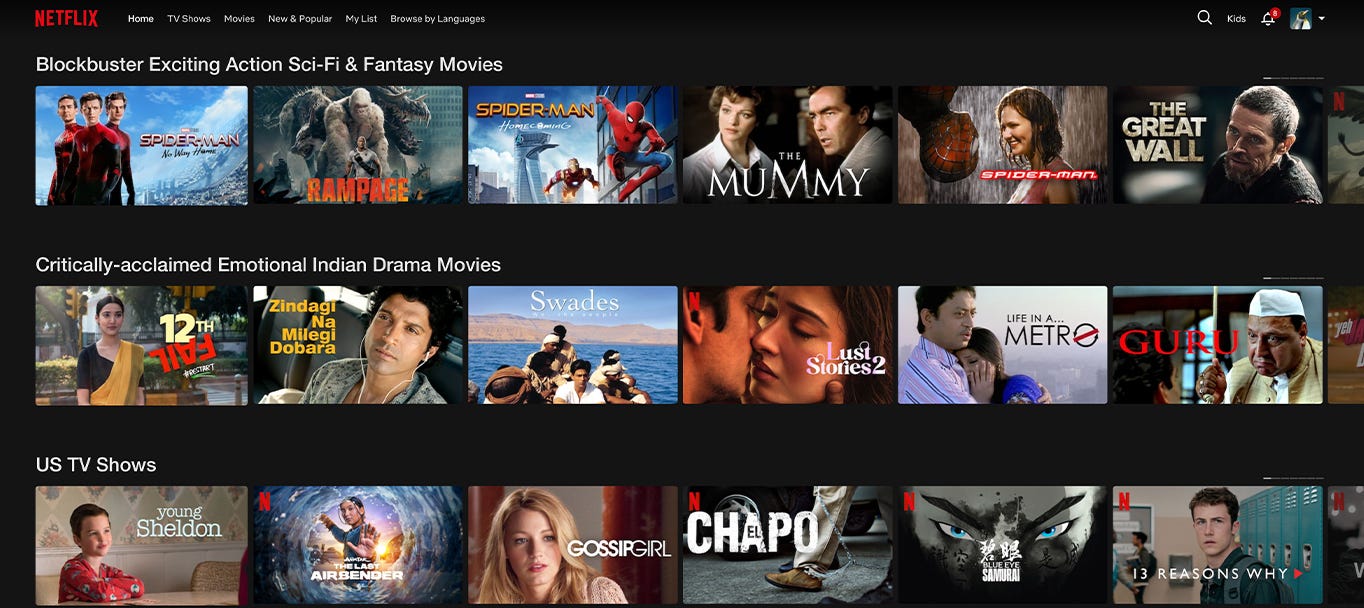
Netflix is a trailblazer when it comes to personalization. Every user’s homepage is uniquely curated based on their viewing history, preferences, and even the time of day they’re likely to watch. This isn’t just a “nice to have” — it’s a core feature of the platform that keeps users engaged.
Example: When you open Netflix, you might notice that the same movie is recommended differently to two people. One person might see a romantic image of the movie, while another sees a more action-packed preview. This subtle personalization is driven by Netflix’s algorithm, which adapts to the user’s preferences and makes them feel like the platform “gets” them.
Takeaway for Designers: Invest in personalization. Leverage user data (behavior, preferences, history) to create a tailored experience. This can be as simple as offering content recommendations based on a user’s past interactions or designing interfaces that dynamically change based on the user’s habits.
Press enter or click to view image in full size
Credit: Netflix
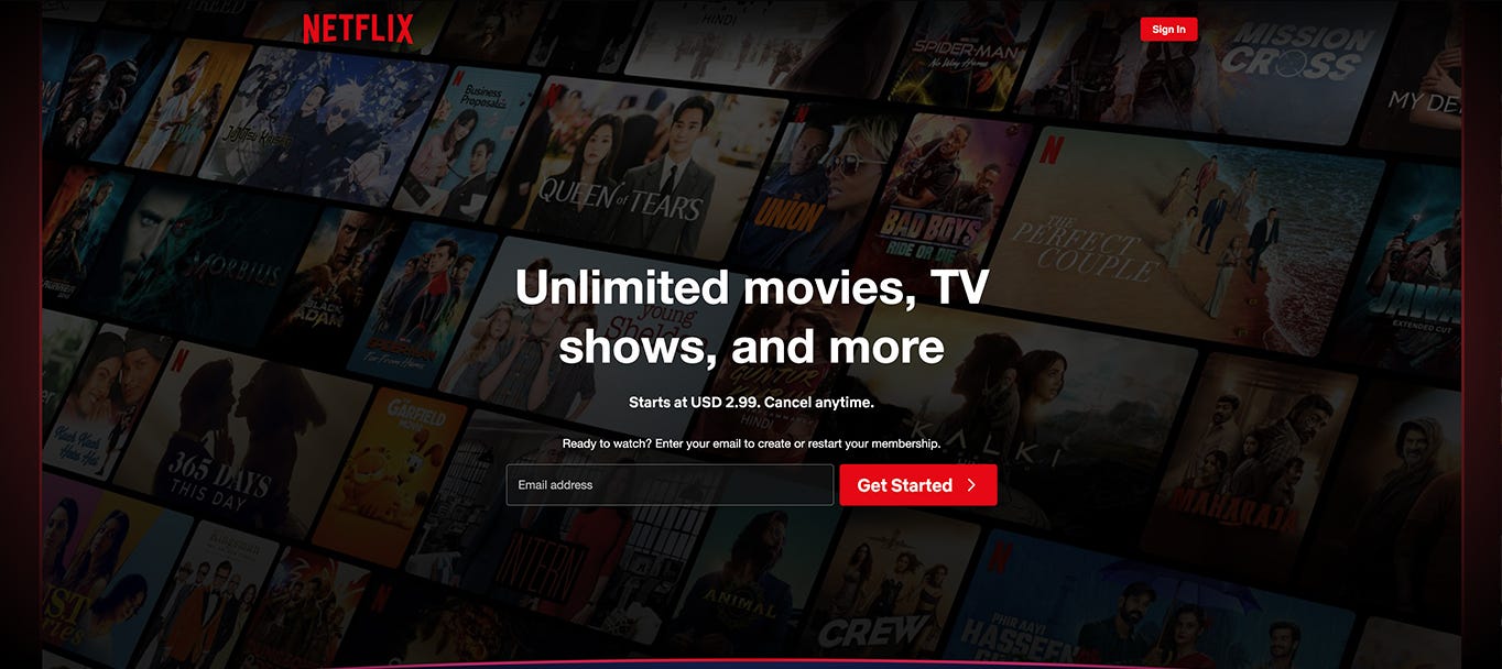
2. Seamless Onboarding Process
From the moment a user signs up, Netflix ensures their journey is as frictionless as possible. The onboarding process is clean, simple, and user-focused. Users are guided through a quick setup where they can select their interests, choose profiles, and start watching in minutes.
Example: Netflix’s sign-up process reduces cognitive load by requiring minimal input from users. By giving users the option to log in with social accounts or save payment details for future billing, Netflix removes potential barriers that could cause users to drop off before they even begin exploring.
Takeaway for Designers: Streamline onboarding. Keep forms short, minimize required fields, and offer helpful prompts along the way. Avoid overwhelming new users with too many options at once; focus on getting them to experience your core value as quickly as possible.
Credit: Netflix
3. Autoplay & Infinite Scroll: The Power of Frictionless Engagement
Netflix’s autoplay feature is one of the most effective hooks for keeping users watching. Once an episode or movie ends, the next one begins automatically — no action is needed from the user. The platform’s infinite scrolling interface, where content is continually presented in a never-ending feed, encourages users to browse for longer periods.
Example: The “Are you still watching?” prompt shows up after a few episodes, acting as a soft interruption while keeping the viewer engaged. It’s a subtle reminder that they’ve been watching for a while, but with a single click, they can continue binging without pause.
Takeaway for Designers: Reduce friction. If you can remove unnecessary steps or clicks in the user journey, do it. Autoplay, infinite scroll, or even progressive loading of content can keep users engaged for longer without them feeling the weight of their actions.
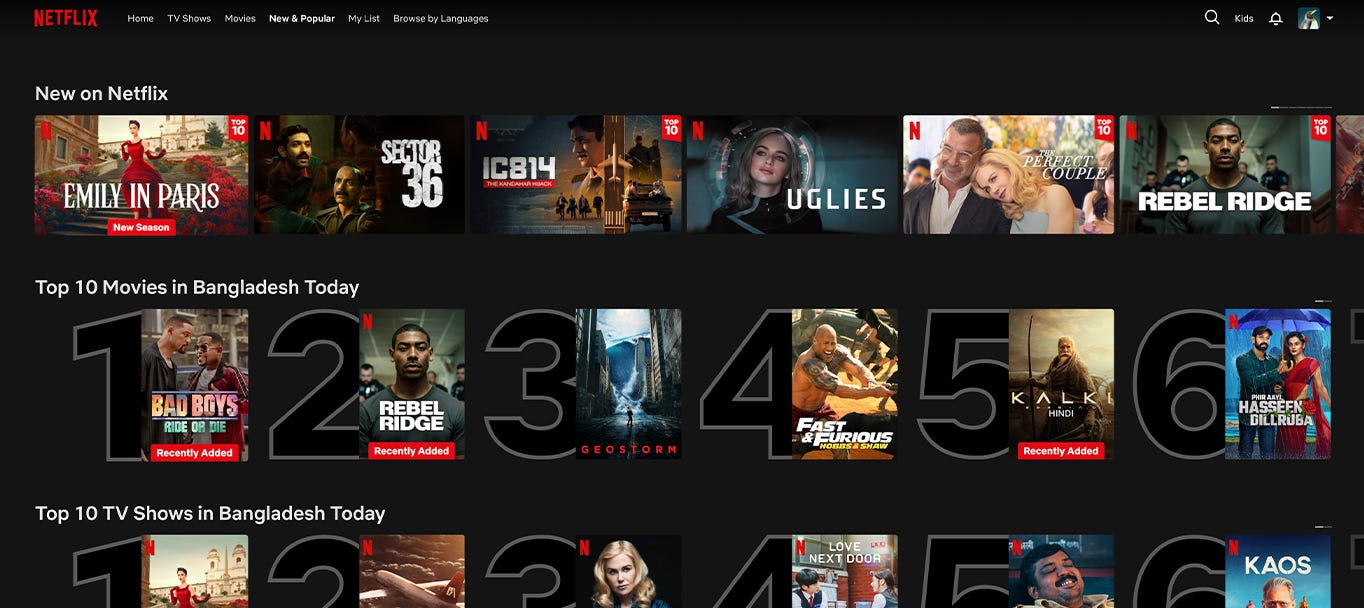
4. Content Categorization & Easy Discovery
Netflix understands the importance of making content easy to find. Their navigation is simple but deep, with well-organized categories, subcategories, and personalized collections. Users can explore by genre, mood, recommendations, or Netflix Originals, making the discovery process as enjoyable as watching the content itself.
Example: Categories like “Top 10 in Your Country” or “Trending Now” make it easy for users to find popular content. Additionally, Netflix’s search functionality is forgiving. Typing partial titles or even actor names brings up relevant results, allowing users to locate what they’re looking for effortlessly.
The takeaway for Designers: Focus on intuitive navigation and content discovery. Categorize your content or services in ways that make sense to the user, not just your team. Consider using smart search algorithms and ensure your navigation menu is easy to use but comprehensive.
Credit: Netflix
5. Binge-Worthy Layout and Interface
The Netflix layout is designed to encourage long viewing sessions. With minimal distractions, users are presented with content front and center. The use of large thumbnails, personalized recommendations, and a clean interface creates a visual appeal that draws users in and keeps them coming back.
Example: Netflix’s clean interface uses a combination of large images, clear titles, and concise descriptions. There are no flashy banners or pop-ups to interrupt the user experience. The focus is on getting the user to click on content they’ll enjoy as quickly as possible.
Takeaway for Designers: Simplicity is key. Keep your UI clean, with minimal distractions. Use bold visuals, clear text, and easy navigation to lead users to the core of your product or service. The goal is to keep them engaged, not overwhelmed.
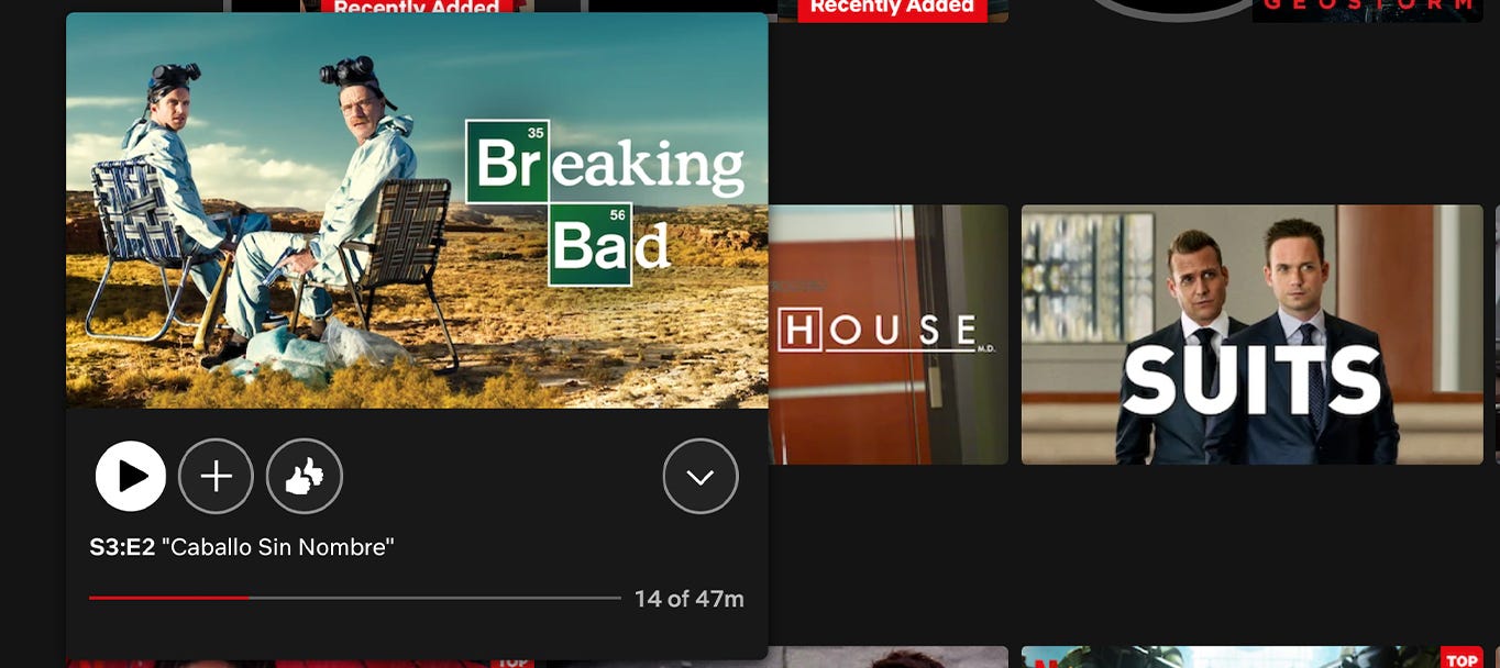
6. Microinteractions: The Subtle UX Enhancers
Netflix uses micro-interactions to guide users subtly. These small animations or feedback mechanisms help users navigate the platform smoothly and enhance their overall experience without them even realizing it.
Example: When a user hovers over a movie or series thumbnail, Netflix plays a short, muted preview. This helps users decide if they’re interested in the content without committing to watching the whole trailer.
Takeaway for Designers: Incorporate micro-interactions into your designs to provide subtle feedback or additional information. They can improve usability by showing users they’ve taken the right action, guiding them through complex flows, or simply making the experience feel more polished.
Final Thoughts: Designing Addictive Experiences Like Netflix
Netflix’s UX is addictive because it combines personalization, seamless navigation, and continuous engagement in a way that feels effortless. By applying these strategies — personalization, frictionless engagement, intuitive navigation, simplicity, microinteractions, consistent branding, and data-driven design — you can create a user experience that not only draws users in but keeps them coming back for more.
Whether you’re designing an app, website, or platform, remember that the best UX is invisible. It guides users naturally, reduces friction, and provides value without them even noticing. Designing like Netflix means making the user experience so seamless that it feels addictive — and that’s what keeps users loyal.


