Bluvana
Bluvana is a reformer Pilates studio built around presence, strength, and intentional movement. The goal of the website was to translate the studio’s atmosphere into a structured digital experience that supports inspiration while guiding users clearly toward booking and class discovery.
Client
Bluvana Reformer Studio
Category
UI/UX DESIGN
Services
Year
2025

Problem
Inspiration Without Clear Direction
Fitness and wellness websites often rely heavily on visuals but lack structural clarity. For Bluvana, the challenge was balancing emotional brand storytelling with practical needs such as class exploration, pricing understanding, and scheduling. Users needed to feel inspired, but also confident about what to book and how to book it.

Complexity
Merging Brand Experience With Flow
The website needed to serve multiple intentions within a single cohesive experience. Visitors come to explore the studio’s philosophy, evaluate class options, compare pricing packages, and check availability. The complexity was aligning these practical functions with a calm, minimal visual identity that reflects the physical studio.
Approach
Designing a Guided Progression
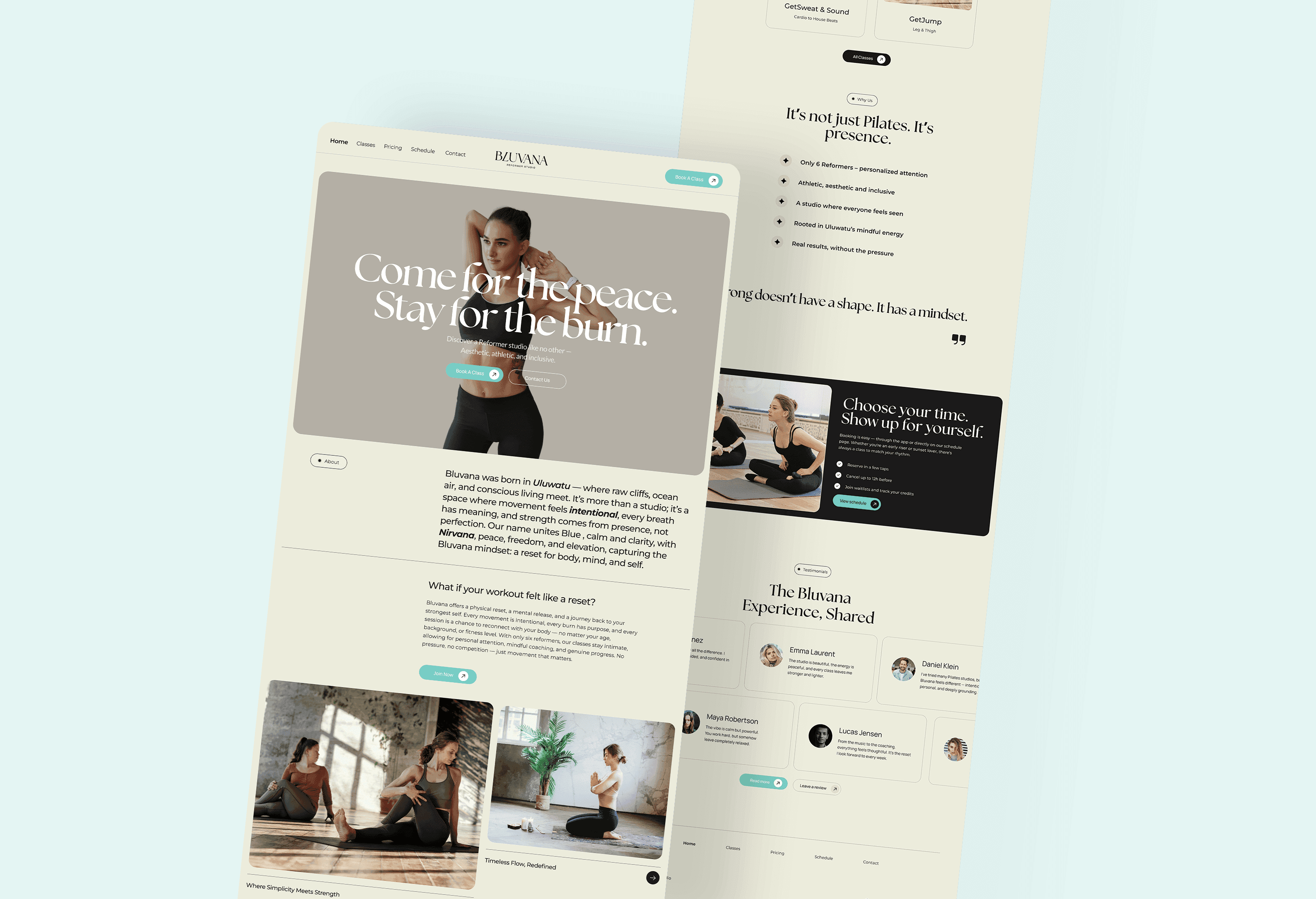
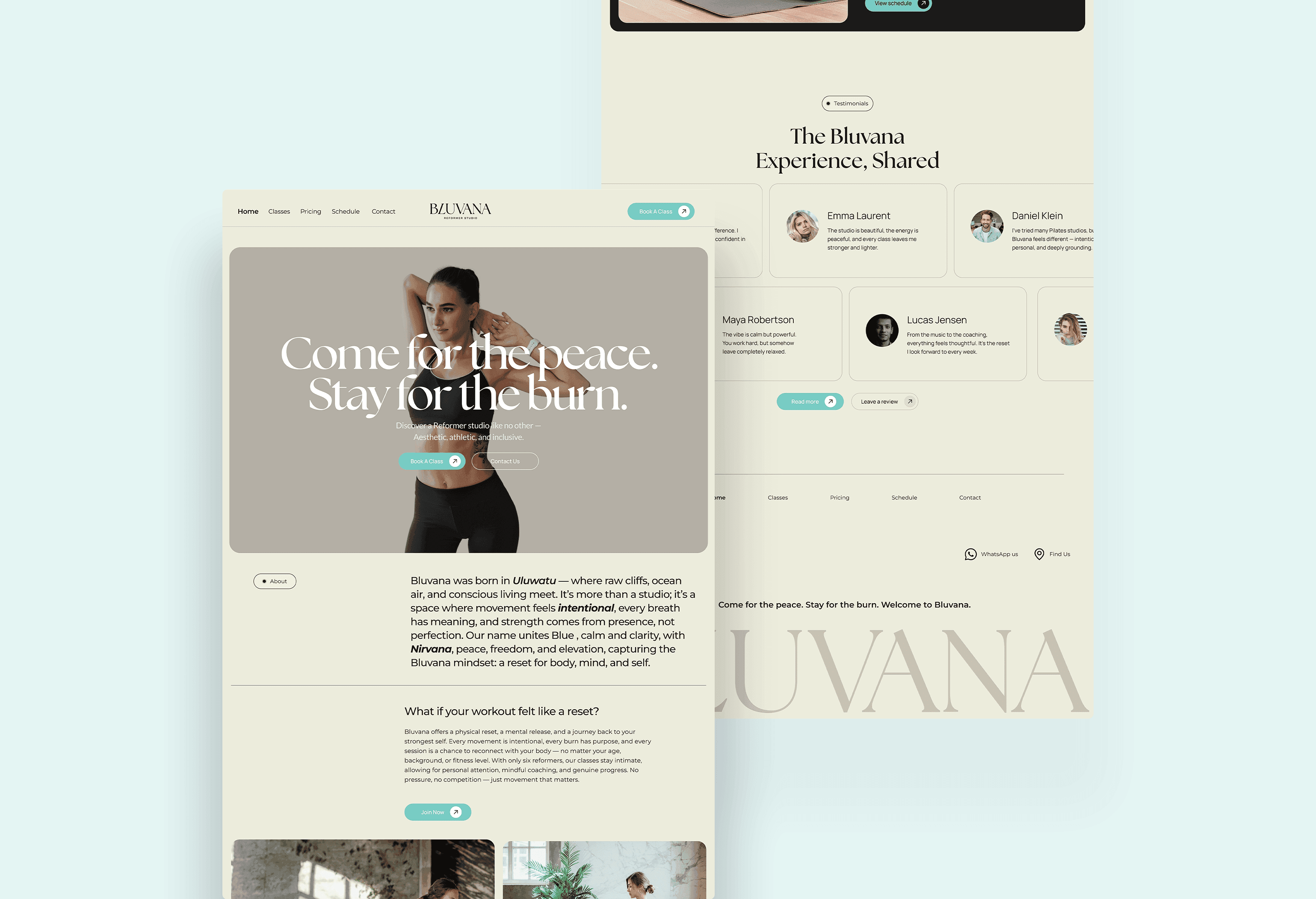
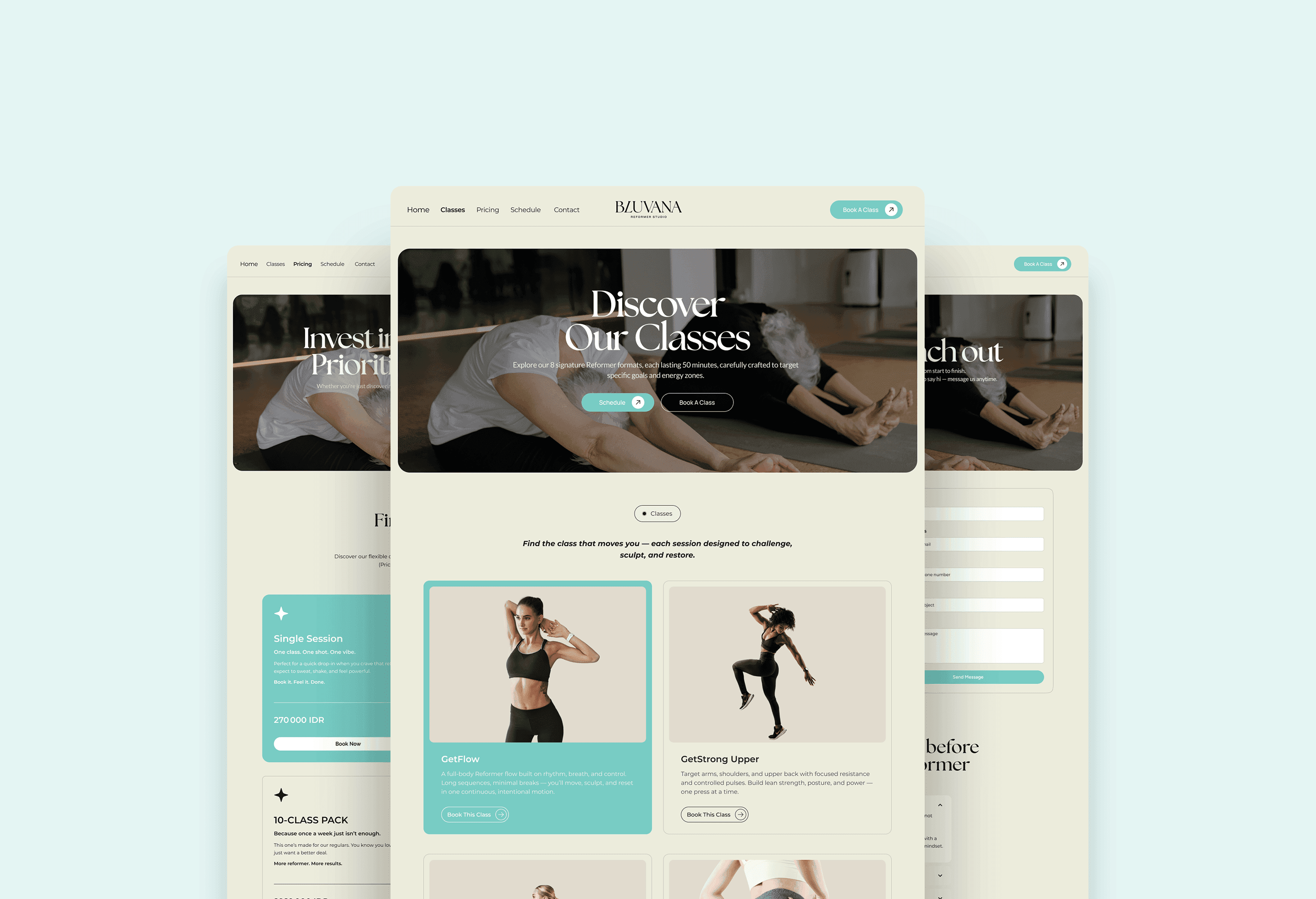
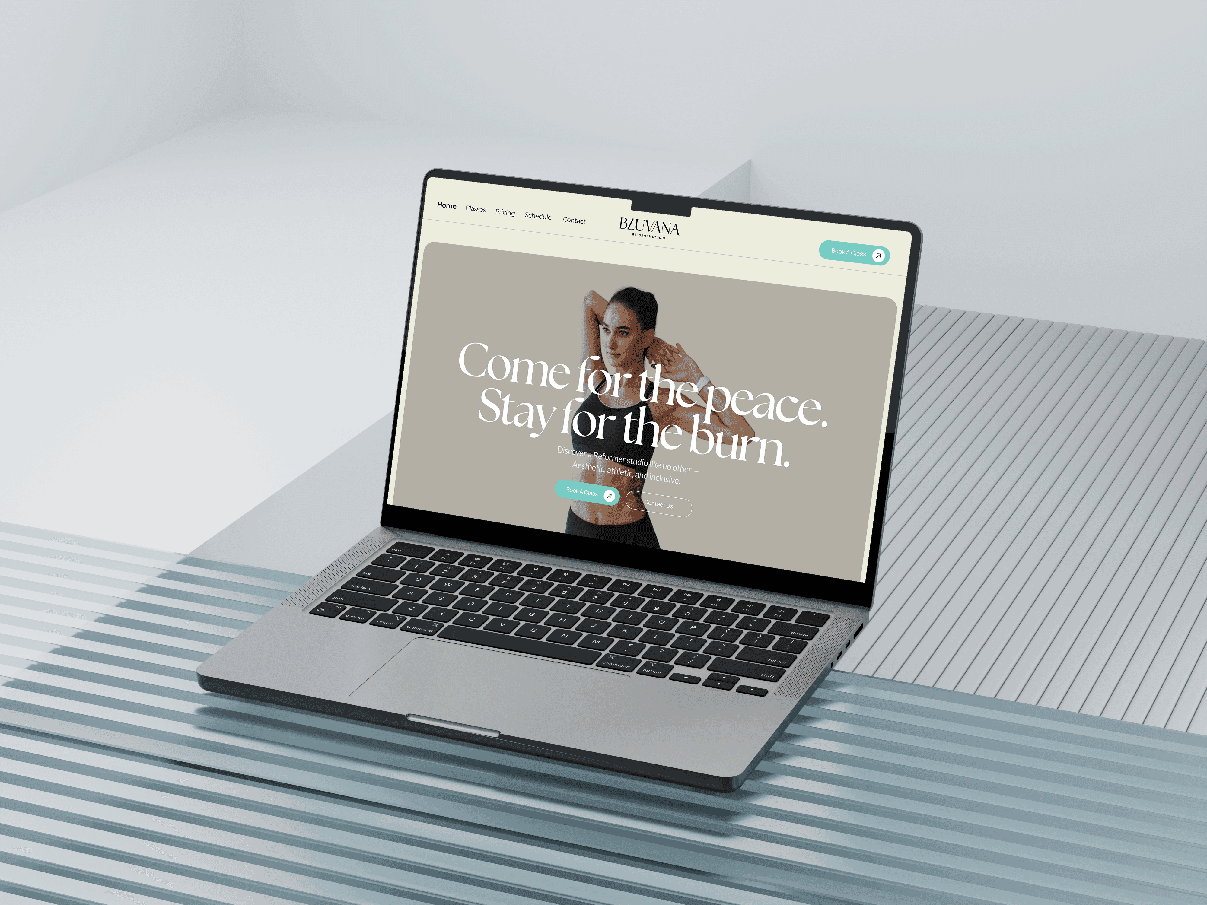
The structure mirrors a natural decision journey. The experience begins with brand positioning and atmosphere, then transitions into class discovery, pricing clarity, and finally scheduling and booking. Each section flows into the next without disrupting the visual rhythm, reinforcing both emotion and usability.
System Architecture
Clear Separation of Key Actions
The architecture intentionally separates exploration from commitment. Classes, pricing, schedule, and contact are clearly defined sections, reducing ambiguity. This separation allows users to move confidently between inspiration and decision without feeling overwhelmed.
Key Ux Decisions
Minimal Interface With Clear Direction
Whitespace, typography contrast, and soft color tones were used to preserve the brand’s calm energy. Calls to action are consistent and visible, but never intrusive. The pricing layout simplifies comparison, and the schedule page prepares for future booking integration while maintaining structural clarity.
Outcome
A Cohesive Brand-to-Booking Experience
The final result is a digital experience that captures Bluvana’s presence while supporting confident decision-making. Users can explore, compare, and book with clarity. The website now aligns emotional storytelling with operational structure, improving engagement and supporting stronger booking flow.

